Phasespace#
This is an example of plotting phase space distributions. First, create a simple line, a tracker and a particle set:
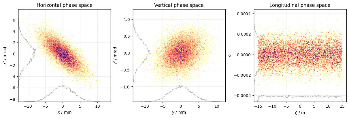
Default phasespace plot#
Create a default PhasespacePlot:
plot = xplt.PhaseSpacePlot(particles)
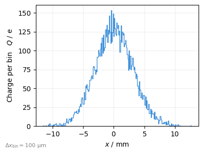
1D Histograms can also be plotted using ParticleHistogramPlot.
By default the particle count per bin is plotted, here we use kind= to plot the charge instead:
plot = xplt.ParticleHistogramPlot(
    "x", particles, kind="charge", bin_width=1e-4, figsize=(4, 3)
)  # bin_width is in data units (m)
Customisation#
Use the parameter kind to specify what is plotted as a comma separated list of pairs a-b.
The properties a and b can be any property of a particle such as x, px, y, delta, zeta, Jx, Θy etc. Note that zeta is the absolute value, while zeta_wrapped is the wrapped value in range (-circumference/2 ; +circumference/2).
See Default properties for a complete list of default properties and refer to Adding custom data properties for an explanation of how to add custom ones.
Tip
The kind= parameter accepts abbreviations for common pairs, e.g. x for x-px, z for zeta-delta or Y for Y-Py
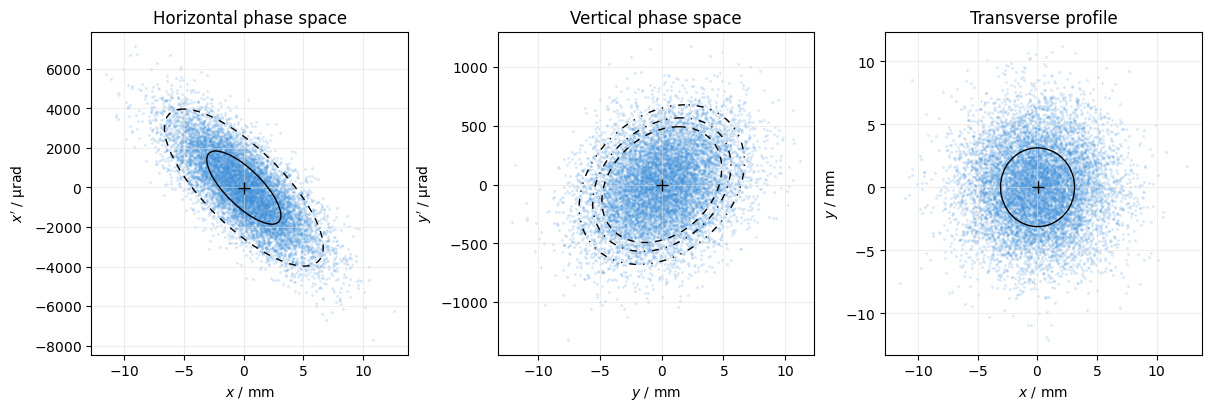
Here we also add some ellipses to indicate standard deviation and percentiles, disable the default projections, and use a scatter plot with some transparency.
See PhasespacePlot for details.
plot = xplt.PhaseSpacePlot(
    particles,
    mask=particles.particle_id < 1e4,
    kind="x,y,x-y",
    plot="scatter",  # using a scatter plot instead of a 2D histogram
    scatter_kwargs=dict(alpha=0.2),  # scatter plot with semi-transparent color
    projections=False,  # No projections onto axes
    display_units=dict(p="urad"),  # p as shorthand for px and py
    mean=True,  # show mean cross for all
    std=[True, None, True],  # show std ellipse for first and last
    percentiles=[[90], [70, 80, 90], None],  # show some percentile ellipses
)
plot.ax[2].set(title="Transverse profile");
Tip
Most parameters accept a list of values to specify different values for each subplot
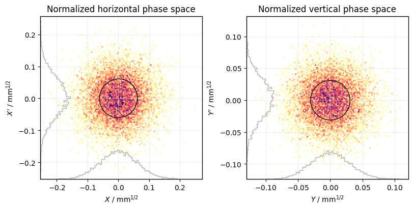
Normalized coordinates#
Calculate twiss parameters for normalization:
tw = line.twiss(
    method="4d",
    at_elements=np.unique(particles.at_element),  # twiss at location of particles
)
Use uppercase letters for normalized coordinates (X is the shorthand for X-Px):
plot = xplt.PhaseSpacePlot(particles, kind="X,Y-Py", twiss=tw, std=True)
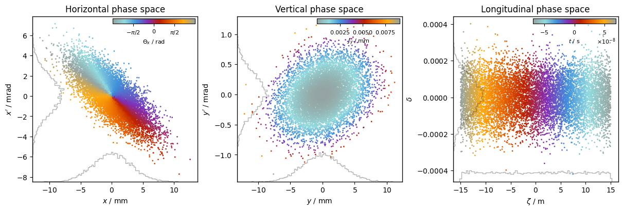
Color by 3rd coordinate#
plot = xplt.PhaseSpacePlot(
    particles,
    "x,y,zeta_wrapped-delta",
    color="Θx,Jy,t",  # <-- color by value
    cmap="petroff_cyclic",
    cbar_loc="inside upper right",
    twiss=tw,
    grid=False,
)
Monitor data#
Track the particle for a couple of turns:
line.track(particles, num_turns=100, turn_by_turn_monitor=True)
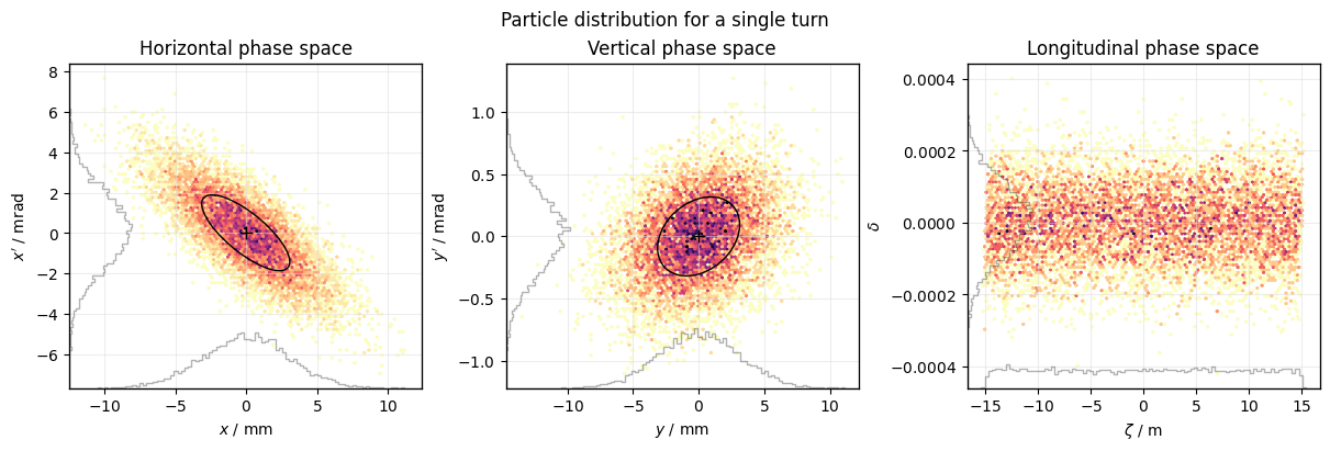
Use mask= to select a subset of the data to plot, e.g. a single turn:
plot = xplt.PhaseSpacePlot(
    line.record_last_track,
    mask=(slice(None), 83),  # select all particles and turn 83
    mean=(1, 1, 0),
    std=(1, 1, 0),
)
plot.fig.suptitle("Particle distribution for a single turn");
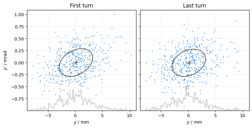
Use masks= to set a different mask for each subplot:
plot = xplt.PhaseSpacePlot(
    line.record_last_track,
    kind="y,y",
    titles=("First turn", "Last turn"),
    sharex="all",
    sharey="all",
    masks=[
        (slice(500), 0),
        (slice(500), -1),
    ],  # select 500 particles at first and last turn
    projections="x",
    mean=True,
    std=True,
)
plot.ax[1].set(ylabel=None);
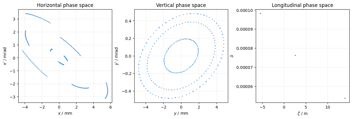
Plot the trace of some particles:
plot = xplt.PhaseSpacePlot(
    line.record_last_track,
    mask=([17, 18, 21], slice(None)),  # select particles 17,18,21 and all turns
    projections=False,
)
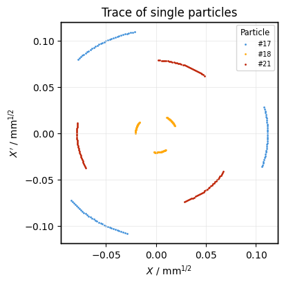
Plot the trace of some particles as distinct plots on the same axis:
ax = None
for particle_i in (17, 18, 21):
    plot = xplt.PhaseSpacePlot(
        line.record_last_track,
        mask=(particle_i, slice(None)),  # select particle i and all turns
        scatter_kwargs=dict(label=f"#{particle_i}"),
        kind="X",
        twiss=tw,
        titles=("Trace of single particles",),
        ax=ax,  # draw on same plot as before
    )
    ax = plot.ax

ax.legend(title="Particle");
See also