Timestructure (Spill, Schottky)#
For some applications it is important to consider the particle arrival time, taking the longitudinal coordinate zeta into account.
This includes non-circular lines, characterisation of extracted particle spills or long-term studies of coasting beams.
The particle arrival time is:
where the first term is only relevant for circular lines.
The plots in this guide are all based on the particle arrival time.
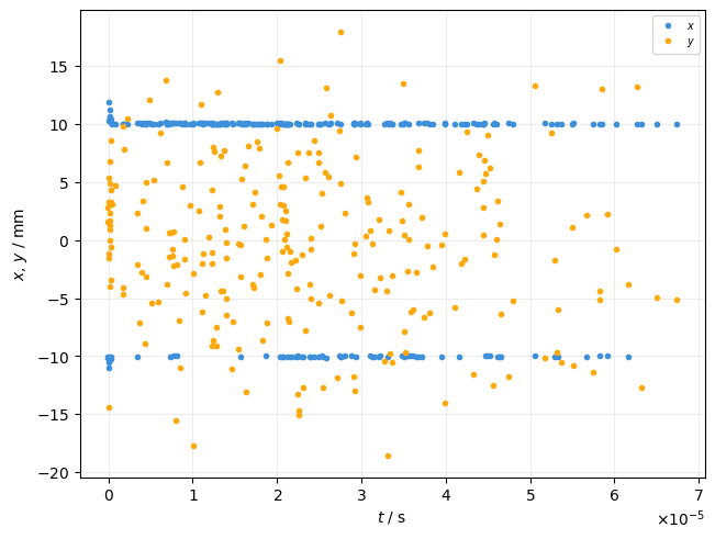
Scatter over time#
The TimePlot allows to plot any particle property as function of time. Here we plot x and y when the particles are lost.
plot = xplt.TimePlot(particles, "x+y", mask=particles.state <= 0, twiss=tw)
Binned time series#
The TimeBinPlot allows to plot particle counts or averaged properties as time series with a given resolution.
Thereby all particles arriving within the interval defined by the time resolution are counted or averaged over.
The time resolution can be given with the bin_time keyword argument.
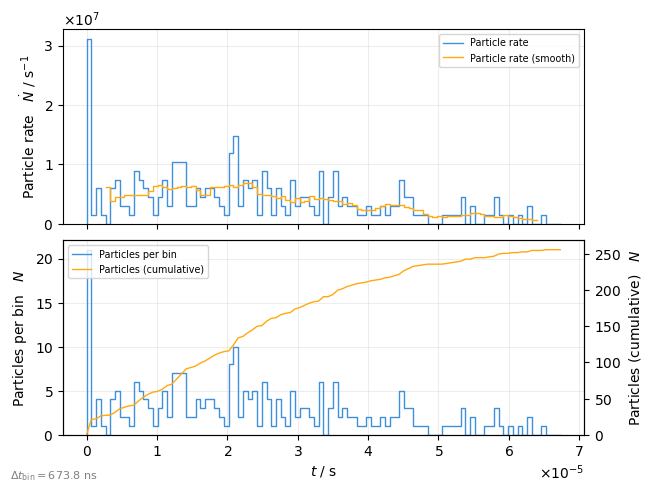
Spill intensity#
Plot number of lost particles as function of time of slow extraction
plot = xplt.TimeBinPlot(
    particles,
    "rate+smooth(rate,n=10),count-cumulative",  # what to plot
    mask=particles.state <= 0,  # lost particles
    twiss=tw,
)
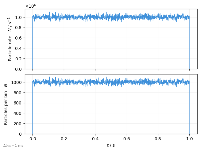
The TimeBinPlot and also many of the following plots supports passing an existing timeseries data instead of (timestamp based) particle data. This is useful to work with data from beam monitors or measurements.
binned_counts = xplt.Timeseries(np.random.poisson(100, size=10000), dt=1e-4)

plot = xplt.TimeBinPlot(
    # timeseries=binned_counts,  # this assumes the timeseries represents counts
    #                            # because 'kind=...' is count-based (rate=counts/s)
    timeseries=dict(count=binned_counts),  # Explicit is better than implicit
    kind="rate,count",
    bin_time=1e-3,
)
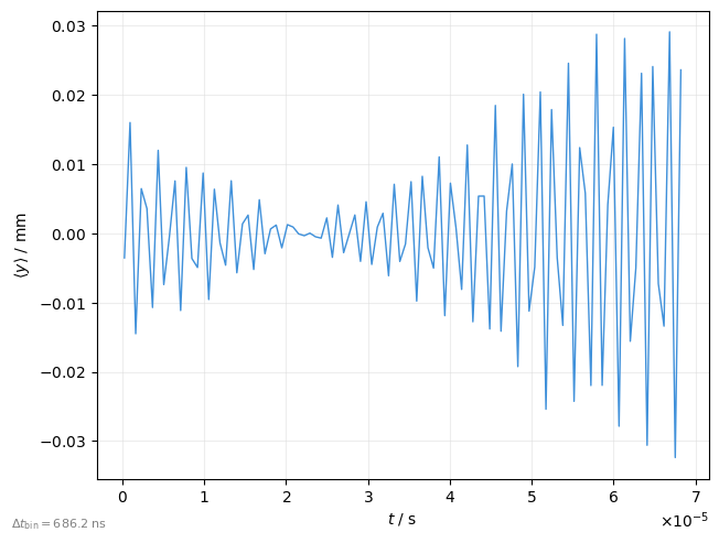
Transverse beam position (BPM)#
Plot average y-position as function of time
plot = xplt.TimeBinPlot(
    line.record_last_track,
    "y",  # y-position
    # moment=1,  # the average (this is the default anyways)
    twiss=tw,
)
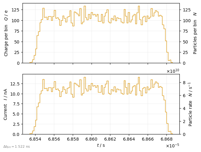
Longitudinal bunch shape#
Plot charge as function of time
plot = xplt.TimeBinPlot(
    particles,
    "charge-count,current-rate",
    twiss=tw,
    mask=particles.state > 0,  # alive particles
)
plot.legend(show=False)
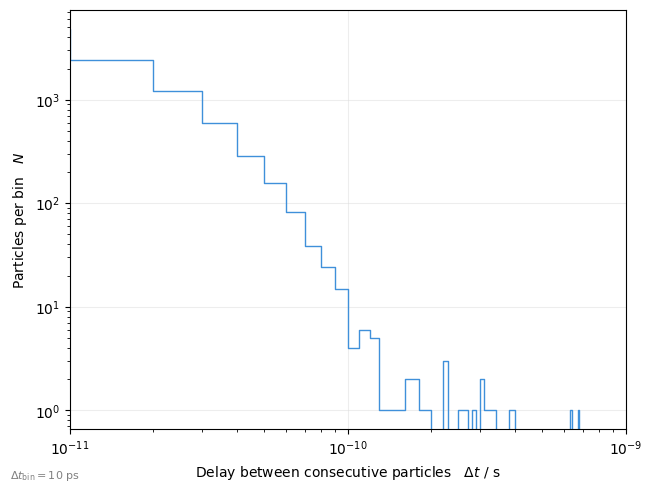
Consecutive particle delay#
The TimeIntervalPlot allows analysis of the delay between consecutive particles.
plot = xplt.TimeIntervalPlot(particles, dt_max=1e-9, log=True, twiss=tw)
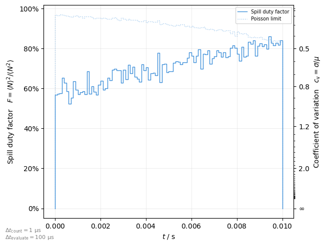
Spill quality#
The following metrices exists to quantify the fluctuation of particle numbers in the respective bins:
cv: Coefficient of variationduty: Spill duty factormaxmean: Maximum to mean ratio
These are useful to assess the spill quality.
Plot a metric as function of time in the spill
plot = xplt.SpillQualityPlot(
    # particles, mask=particles.state <= 0, twiss=tw, # pass the lost particles
    timeseries=xplt.Timeseries(  # we can also use pre-binned timeseries data instead
        counts, dt=1e-6
    ),
    kind="duty",
    counting_dt=None,  # interval for particle counting for (re-)binning
    evaluate_dt=None,  # interval to evaluate metric
)
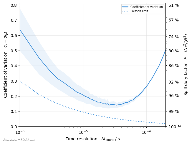
Plot a metric as function of timescale (counting bin time)
plot = xplt.SpillQualityTimescalePlot(
    # particles, mask=particles.state <= 0, twiss=tw, # pass the lost particles
    timeseries=xplt.Timeseries(
        counts, dt=1e-6
    ),  # or we can also use pre-binned timeseries data instead
    kind="cv",
)
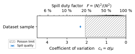
Make a custom spill quality plot
dt_count = 50e-9
bins = 1000
dt_evaluate = dt_count * bins

# use helper to calculate metric
helper = xplt.TimeBinMetricHelper(twiss=tw)
t_min, dt_count, counts = helper.binned_timeseries(
    particles, dt_count, mask=particles.state <= 0
)
Cv, Cv_poisson = helper.calculate_metric(counts, "cv", bins)

# plot it
fig, ax = plt.subplots(figsize=(4, 1), constrained_layout=True)
style = dict(marker=".", ls="", capsize=3, label="Spill quality")
ax.errorbar(np.nanmean(Cv), ["Dataset sample"], xerr=np.nanstd(Cv), **style)
style = dict(hatch="////", ec="#aaa", fc="none", label="Poisson limit")
ax.add_patch(
    mpl.patches.Rectangle((np.nanmean(Cv_poisson), -0.15), -10, 0.3, **style)
)
ax.set(xlim=(4.5, 0))

# use helper to style axes
helper._link_cv_duty_axes(ax, ax.twiny(), True, "x")
ax.legend(loc="upper right", bbox_to_anchor=(0, 0));
Frequency domain#
The TimeFFTPlot allows frequency analysis of particle data. Therefore the data is first binned into an equidistant time series as described above, and then an FFT is performed. This allows to plot the frequency spectrum of particle arrival time:
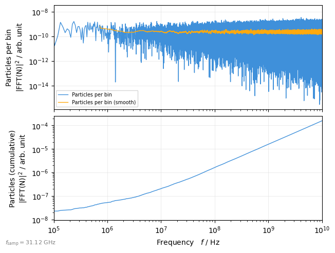
Spill fluctuations#
plot = xplt.TimeFFTPlot(
    particles,
    "count+smooth(count,n=100),cumulative",
    mask=particles.state <= 0,  # only lost particles
    fmax=1e10,
    log=True,
    twiss=tw,
)
plot.ax[0].set(xlim=(1e5, None))
for a in plot.ax:
    a.set(ylabel=a.get_ylabel().replace("   ", "\n"))
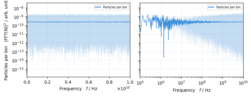
Since log-scaled FFT’s are typically very noisy, we can activate averaging. This does not only help to compare multiple FFTs in a single plot, it also reduces the number of datapoints to plot which speeds up rendering. The range (min/max) of the original data is shown as shodow to give an impression of how the FFT would look like without the averaging applied:
fig, ax = plt.subplots(1, 2, figsize=(8, 3), sharey=True)

for i, a in enumerate(ax):
    plot = xplt.TimeFFTPlot(
        particles,
        mask=particles.state <= 0,
        twiss=tw,
        fmax=1e10,
        log="xy" if i else "y",
        averaging=dict(
            lin=1000,  # for lin-scaled plots: integer number of bins to average
            log=1.01,  # for log-scaled plots: increment factor for bin number
        )["log" if i else "lin"],
        averaging_shadow_kwargs=dict(alpha=0.3),  # options to adjust the shadow
        ax=a,
    )
ax[1].set(xlim=(1e5, None), ylabel=None);
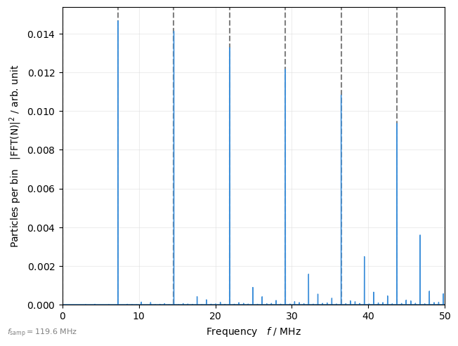
Longitudinal schottky spectrum#
# select only a single particle
mask = (0, None)

plot = xplt.TimeFFTPlot(
    line.record_last_track,
    "count",
    mask=mask,
    fmax=50e6,
    log=False,
    display_units=dict(f="MHz"),
    twiss=tw,
)

frev = 1 / tw.T_rev0
for i in range(10):
    plot.ax.axvline(i * frev / 1e6, ls="--", color="gray", zorder=-1)
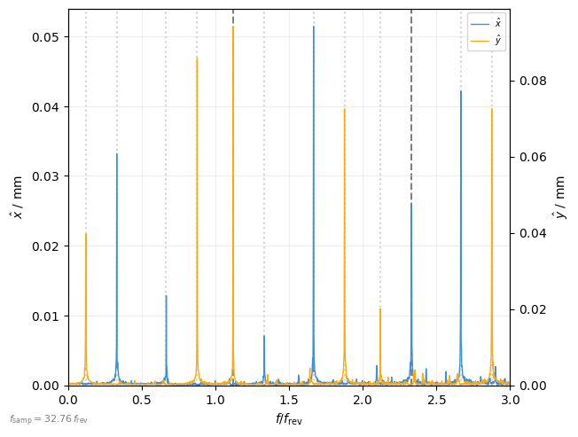
Tune or transverse schottky spectrum#
Simmilary, the frequency spectrum of transverse motion (betatron tune spectrum) can be plotted. Note that the spectrum is based on transverse position as function of time and not as function of turn (this gives access to frequencies above half the revolution frequency and allows to avoid aliasing).
plot = xplt.TimeFFTPlot(
    line.record_last_track,
    "x-y",
    twiss=tw,
    relative=True,
    log=False,
    fmax=3 * frev,
    fsamp=30 * frev,  # high sampling frequency to reduce aliasing
)

for Q in (tw.qx, tw.qy):
    plot.ax.axvline(Q, ls="--", color="gray", zorder=-1)
    q, h = np.modf(Q)
    for h in range(int(plot.ax.get_xlim()[1] + 1)):
        [
            plot.ax.axvline(x, ls=":", color="lightgray", zorder=-1)
            for x in (h - q, h + q)
            if x != Q
        ]
For reference, the spectrum of turn-by-turn positions:

See also